



Getting people from checkout to a working phone
Context
REALLY is a mobile carrier built for people who stopped trusting the big ones
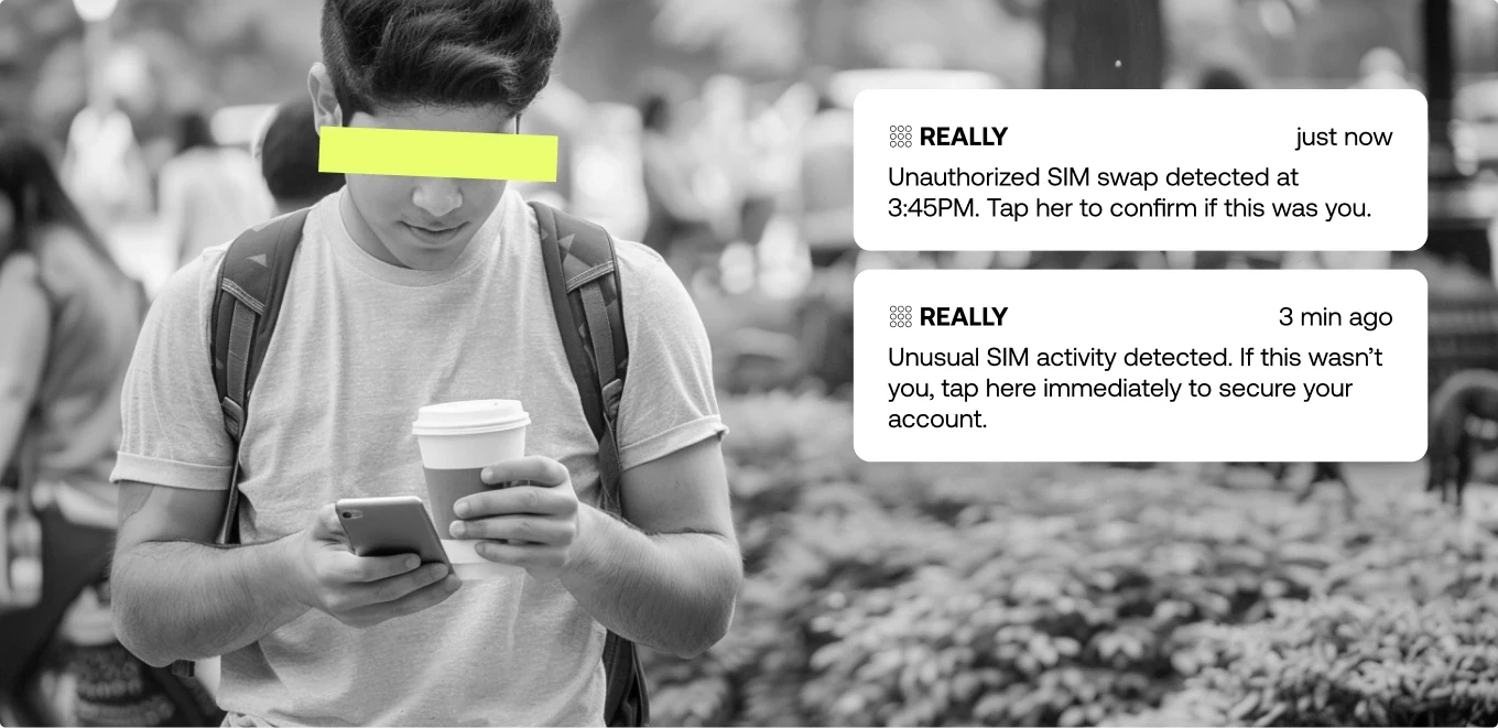
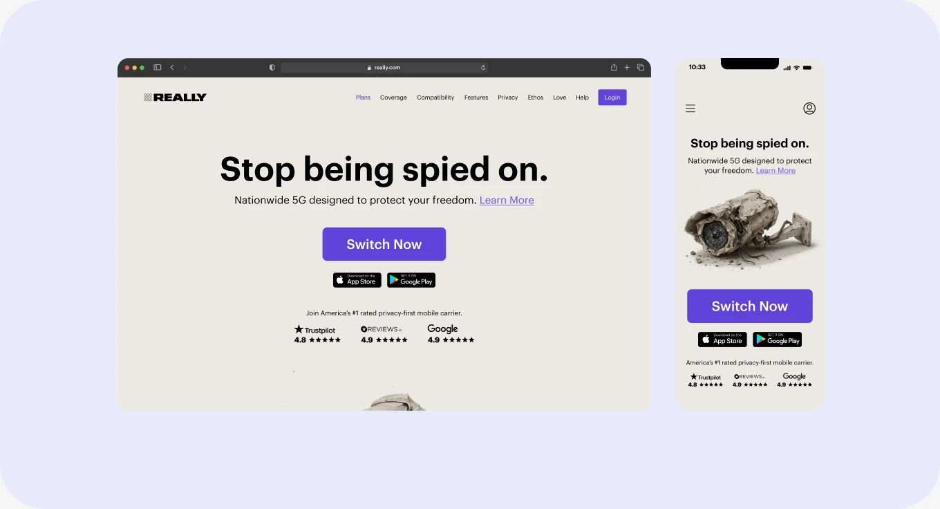
A privacy-first wireless service, REALLY strips out the parts of a carrier most people don’t know they’ve agreed to. No ad targeting, no location selling, no data brokers, no trackers riding along with your service. Just a phone plan that doesn’t treat you as inventory.
That positioning brought in a specific customer: someone who’d already decided the mainstream options weren’t for them and had gone looking for an alternative.
Product problem
People were buying, then never getting activated
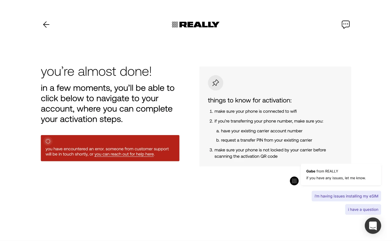
Customers paid on the marketing site, then hit five steps before their phone worked: pull the old SIM, connect to wifi, get an account number and transfer PIN from their old carrier, install an eSIM in system settings, set up recovery.
Business problem
A $1M ARR target, and a funnel losing people before they ever used the product
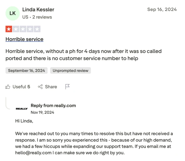
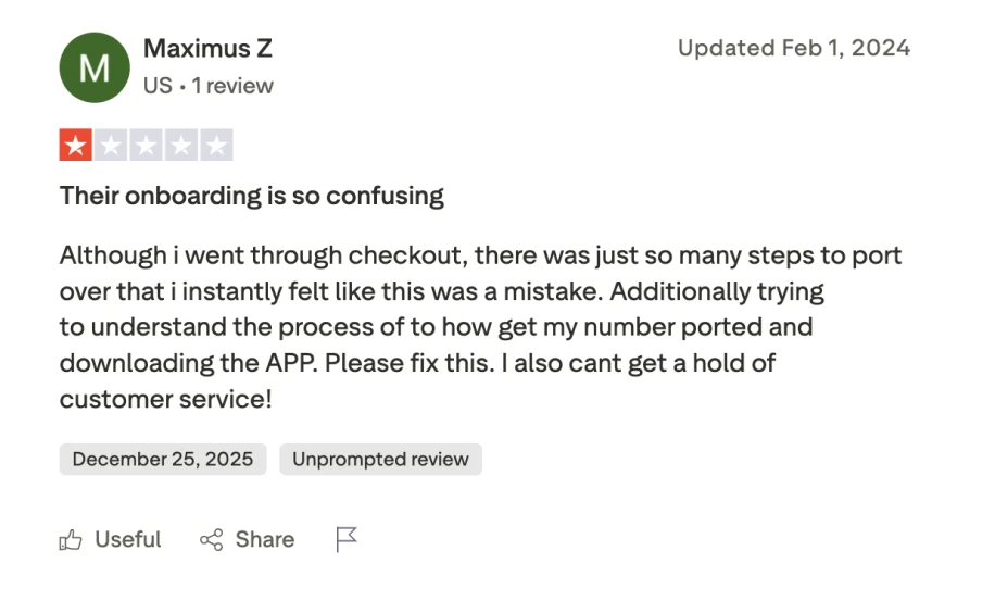
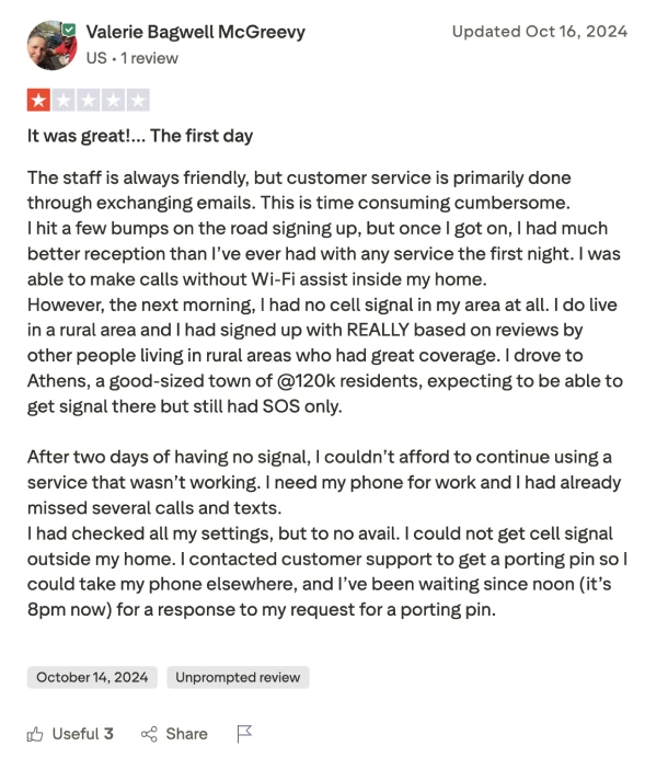
Every person who stalled left twice: once as revenue, once as a review.
REALLY couldn’t outspend the big carriers, so growth ran on credibility. Reviews fed marketing, marketing fed the funnel. A broken activation flow didn’t just leak customers, it made the next one cost more.
Most expensive users to lose. Already acquired, already paid. Gone after the hard part was over.
Support absorbed it. Every stuck user became a ticket.
The loop ran backwards. Bad activation, bad reviews, weaker marketing, harder target.
How might we turn the hardest part of switching mobile carriers into the moment people start trusting us?
The solution
Rebuilding activation as a flow we could actually control
Activation lived on the web, built by engineering before there was a design team. The app came later, and by then the hardest part of the experience was somewhere we couldn’t shape.
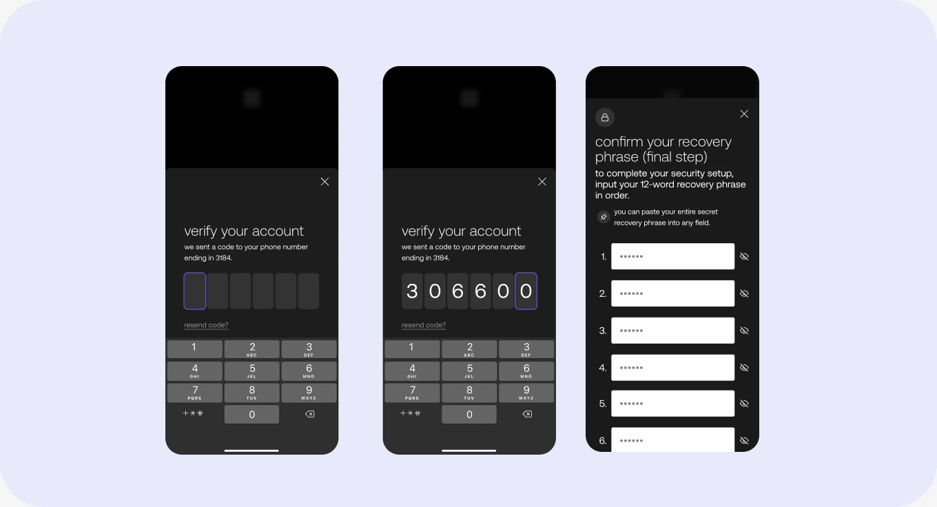
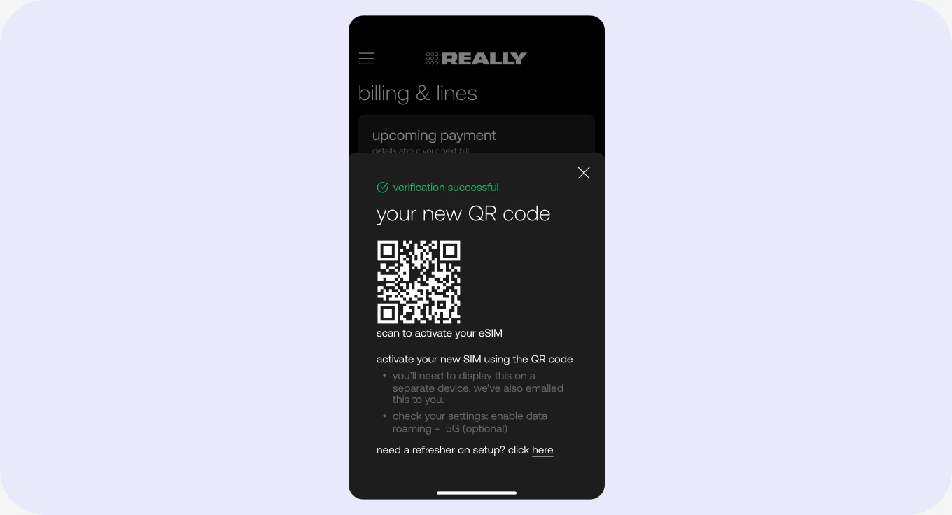
So we moved it. After checkout you download the app, scan a QR code, and you’re in. Four screens to onboard, five to activate.
One continuous path. No redirects, no separate login.
Presence during the handoff. The app stays open while you install an eSIM in system settings. It knows if wifi drops.
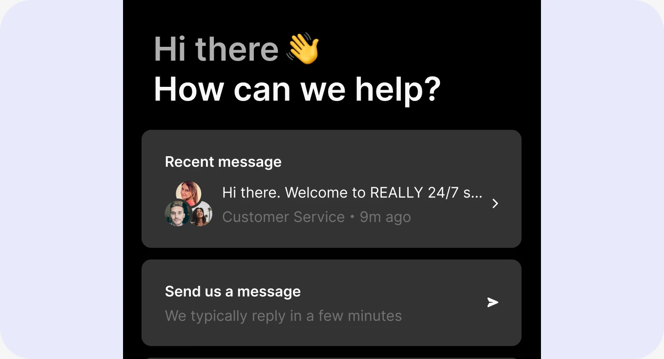
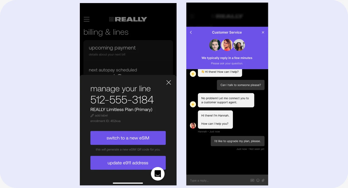
Help where the trouble was. Support chat on every screen.
Added account security. Recovery phrase.
Analyze
Mapping what activation actually was
There was no single view of the flow. Screens lived across web and app, some in production, some half-built, none documented.
So I mapped all of it in Figma. Every screen, every state, marked by what was live and what was coming. It became the reference the design team worked from.
Laid out end to end, it was 17 screens, most of them dense with copy. We were explaining instead of guiding.
Then we needed numbers. I worked with engineering, customer support, and our PM to get Google Analytics instrumented across the marketing site and the funnel. Before that we knew activation was leaky. After it, we knew where.
Diagnose
Analytics showed us where people dropped. They didn’t tell us why
Support already knew. They’d been on the phone with stuck users every day, hearing the same problems, and none of it had ever made it into a design decision.
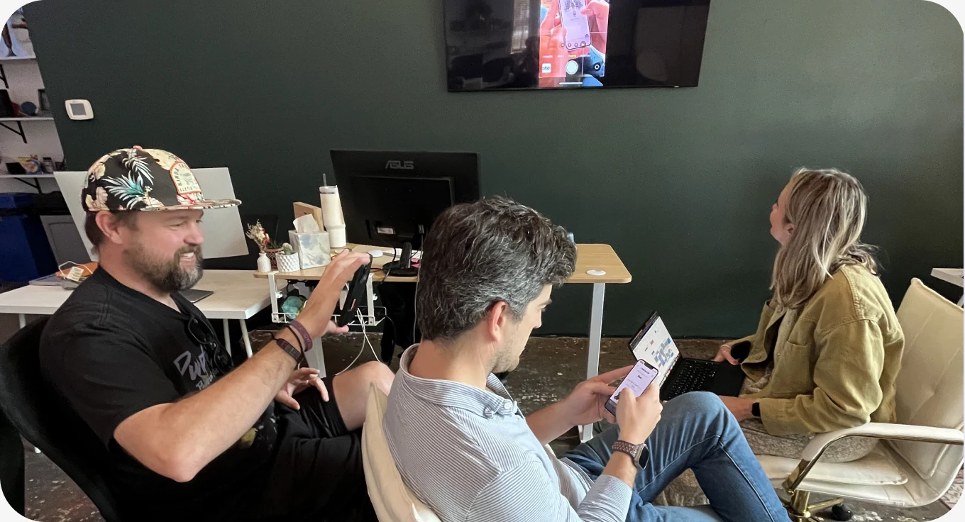
So I went and got it. I pulled the recurring failures out of tickets and calls, ran workshops with design, engineering, and our PM to get the whole team in front of the same flow, then tested it with users and watched where they hesitated.
Three things kept coming up:
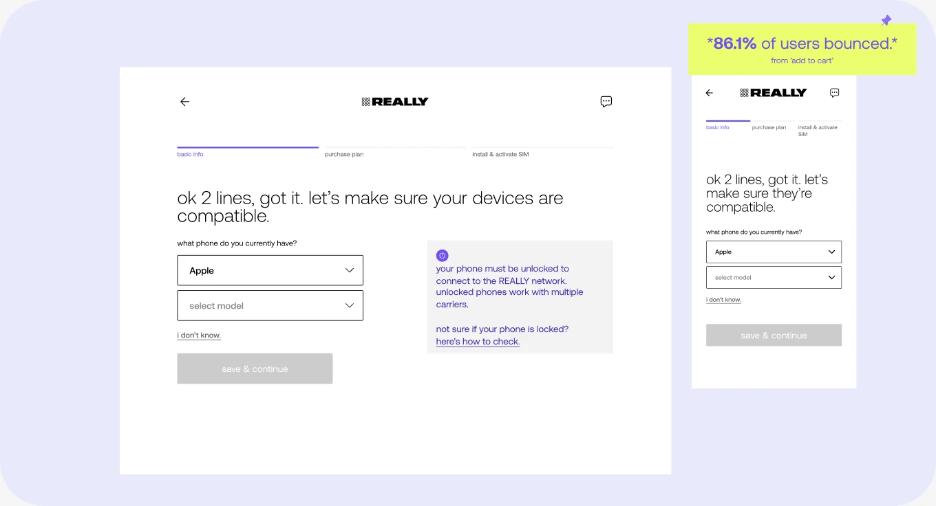
Nobody knew the rules before they started. You had to be on wifi, and your phone had to be paid off, before you could switch carriers at all. People found that out mid-flow, after they’d already paid.
Porting was the wall. Too many steps, each one dependent on the carrier they were leaving. Most people who abandoned did it here.
Errors had no exit. Instructions weren’t clear, the product threw errors, and there was no one to ask. People were stuck with nothing to do but leave.
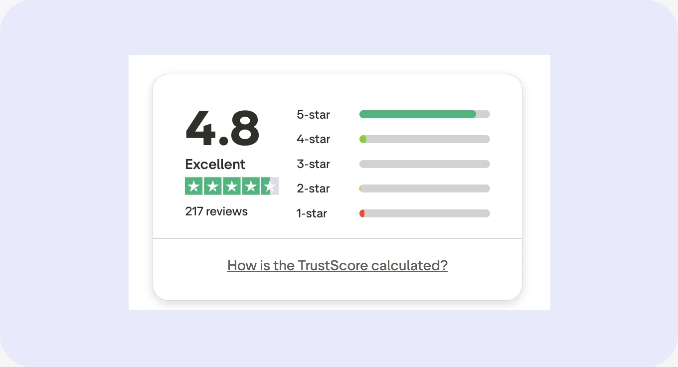
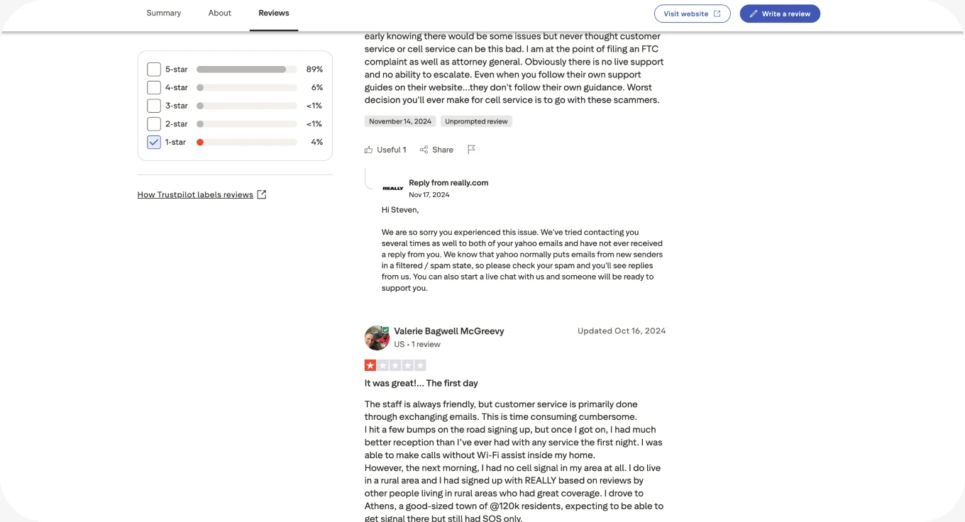
The Trustpilot reviews had been saying all three publicly the whole time. We just hadn’t been treating them as research.
Designs
Designing the fixes
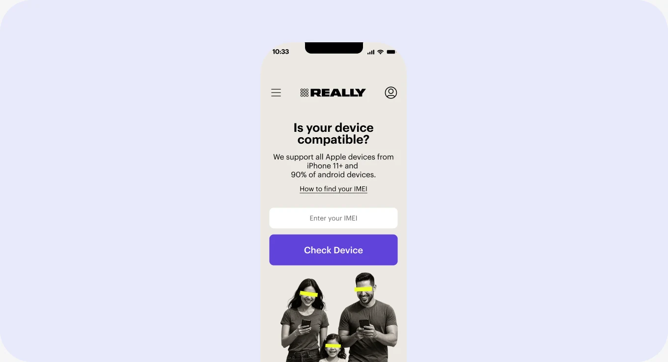
Tell people the rules first.
A readiness check before anyone leaves the app: wifi connected, old SIM handled, account number and transfer PIN in hand. Prerequisites moved to the front instead of ambushing people mid-flow.
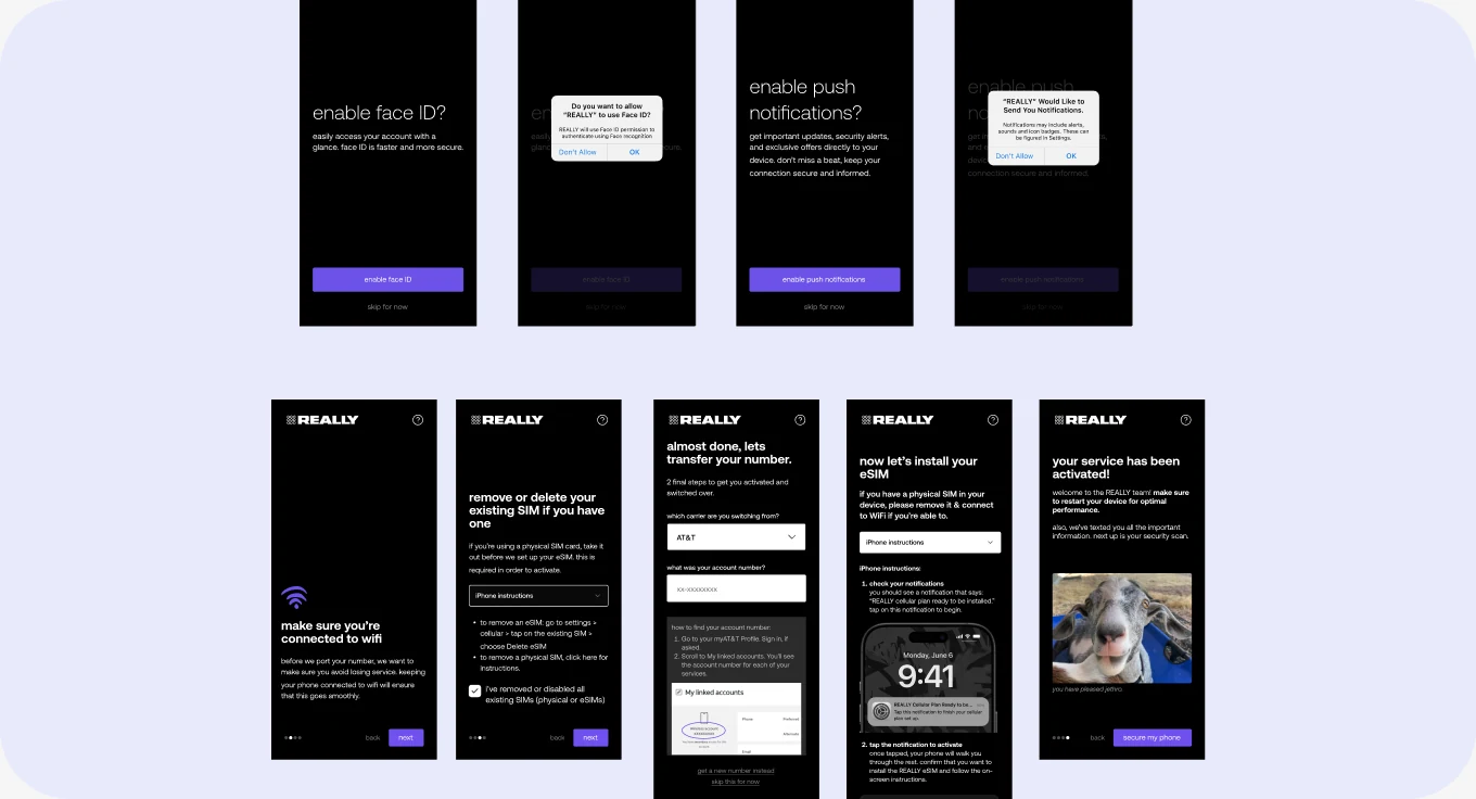
I cut the path in half.
17 screens to 9. Four to onboard, five to activate. Every screen I cut either duplicated something or explained something I could show instead.
Stay with people through the handoff.
The eSIM install happens in system settings, outside our product. The app holds its place, watches for wifi, and picks back up where you left.
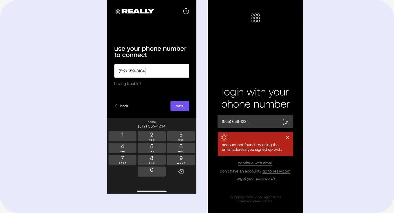
Give them somewhere to go when it breaks.
Errors stopped being dead ends, letting the product serve itself.
Learnings and looking forward
Fixing the leak wasn’t the same as fixing the product. We recovered a lot by removing friction, but the flow still didn’t feel like the brand it was attached to. Privacy-first is a promise about care, and activation should have felt like care rather than instructions. We ran out of runway before it did.
Simple, clear, and trustworthy is one job, not three. Every screen we cut made the flow faster and made it feel more credible. Speed and trust turned out to be the same lever, which isn’t what I expected going in.
I should have gone to engineering earlier. The web flow existed because it was the fastest thing to build at the time. Understanding those constraints from the start would have made the app move—an easier conversation and probably a faster one.
If I did it again
I’d stay with it past launch. We shipped, saw the lift, and moved on to the next thing, so I never learned whether 32% held at three months or six. I’d want A/B testing running continuously instead of one before and after, and I’d want to know what happened downstream: did the reviews actually move, did support volume drop, did any of it reach the ARR target we were chasing.
We were on a tight deadline and I made deadline decisions. I’d make most of them again. I’d just want to know how they aged.
